Lumen
← BackRole: UX/UI Designer & Researcher (Master's Thesis) Duration: 6 months Tools: Figma, user interviews, thematic analysis
A social platform redesigned around transparency and positive friction, so consequences of every action are visible before they happen.
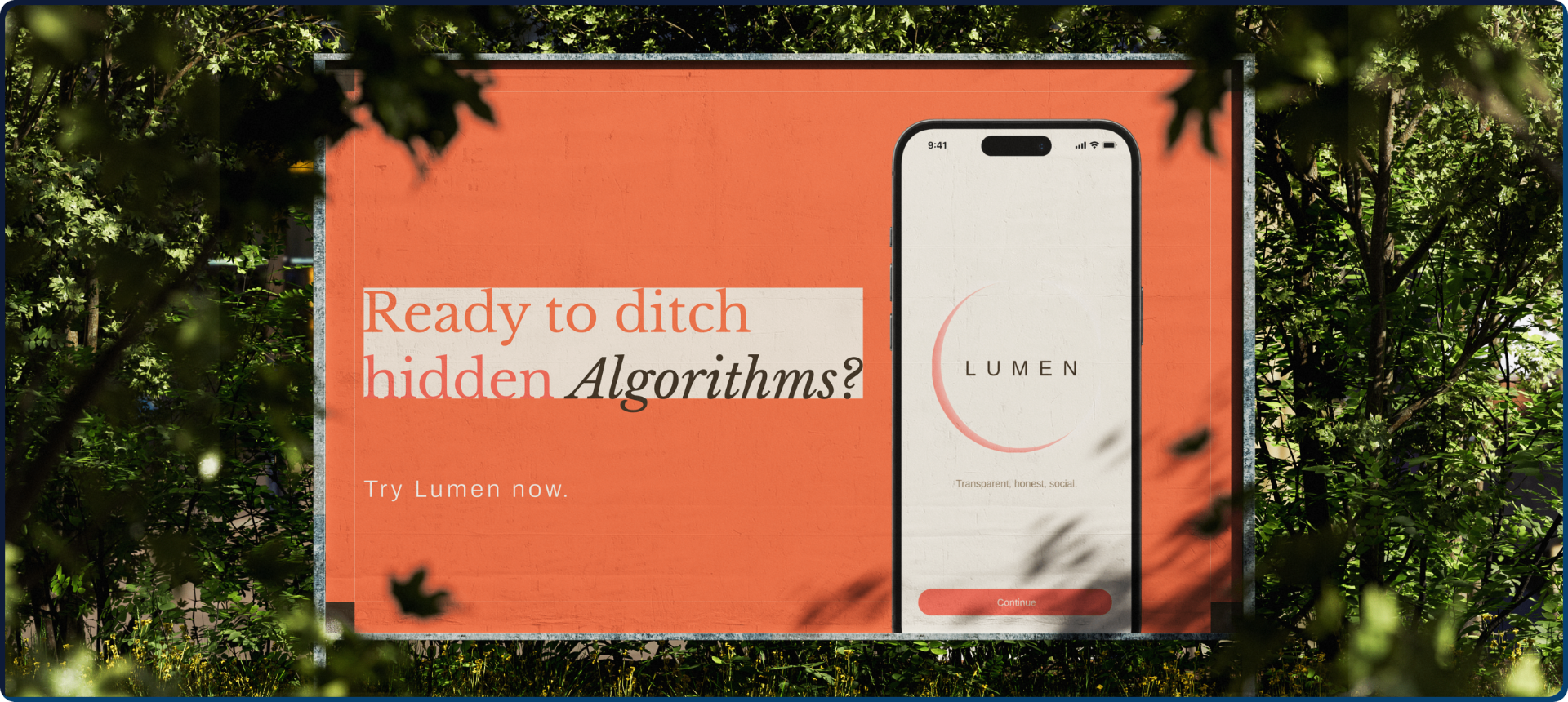
The Challenge:
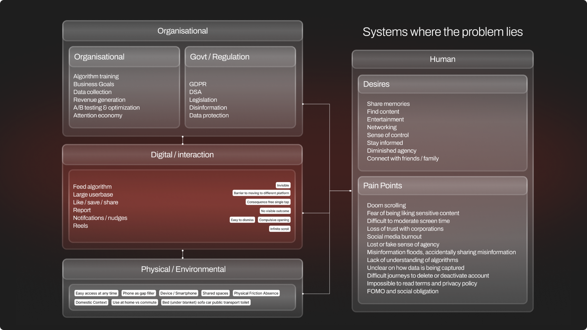
Social platforms hide consequences. Friction is treated as failure, not respect. We like, we share — zero visible impact.
people
Participated in my research study
nations
Between my test group
platforms
Tested and evaluated
Design Process
How I managed to create this experience in a couple of days? I followed a lean UX method which streamlined processes to ensure timely delivery.
Research
Relevant patterns from my literature study
1. Dark Patterns
Dark patterns such as overloading, stirring, obstructing, and leaving people in the dark benefit the platform by steering behaviour people would not choose under fully informed conditions. Attention-capture features such as infinite scroll, autoplay, and continuous refresh support low-awareness, dissociative use, and reduce people's sense of control. This means the problem is not only hidden information, but also interface conditions that make reflection less likely.
2. Algorithmic Transparency & Trust
Research on algorithmic transparency shows that transparency is not only a disclosure issue, but a trust issue. Trust is built by abstract institutional claims and more by direct, legible interaction with a system.
3. Slow Technology
Work on domestic computing shows that older computing environments had natural social and spatial moderators that slowed conversation, reflection, and awareness of how can be delegated for rather than treated as usability failures.
4. Positive Friction
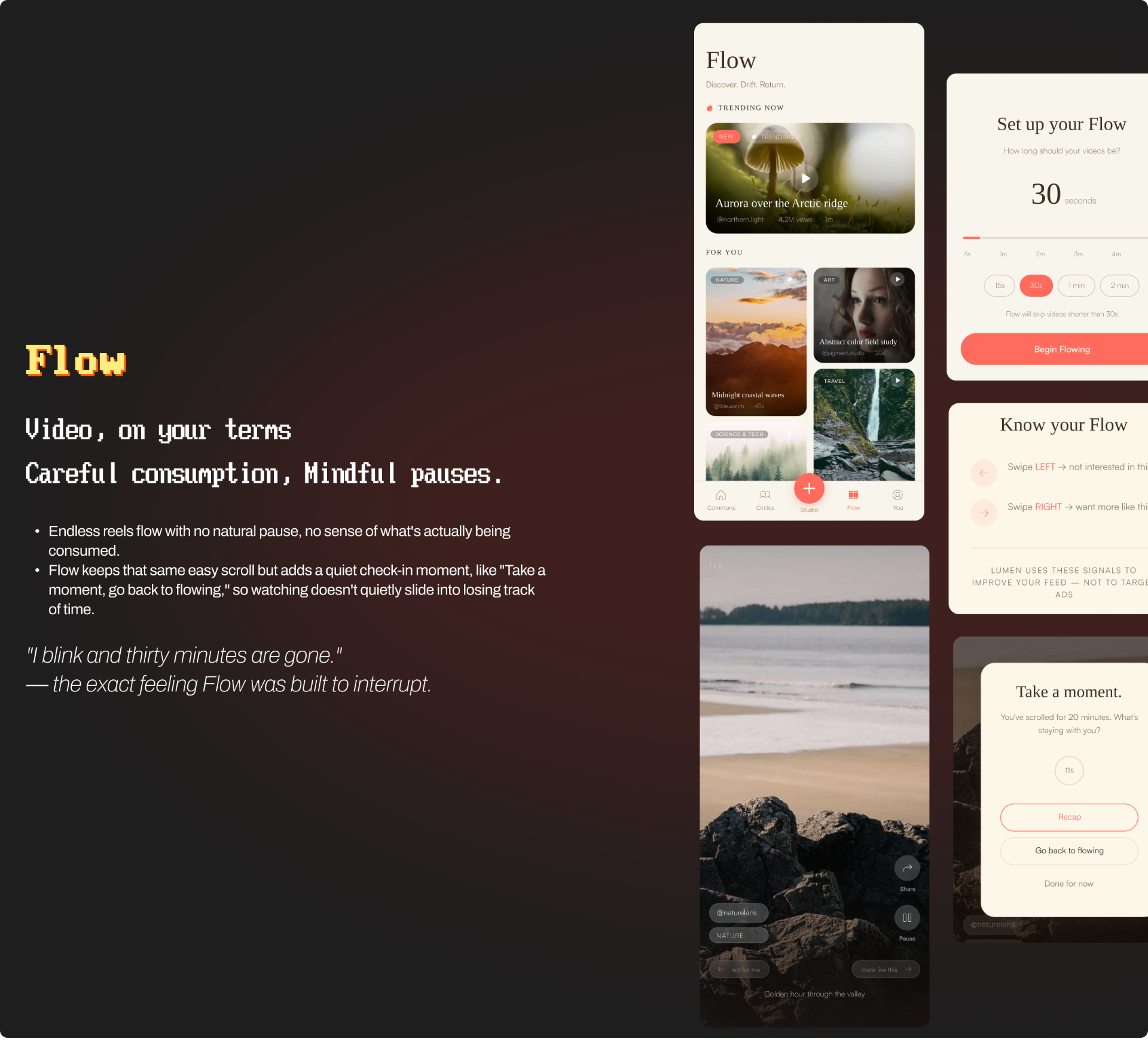
Against frictionless UX, a growing body of work argues that carefully introduced friction can support better decisions, self-regulation, and reflection. These interventions can improve perceived agency and consume quality more effectively than external self-control tools, because they operate within the interaction itself.
Competition & Benchmarking
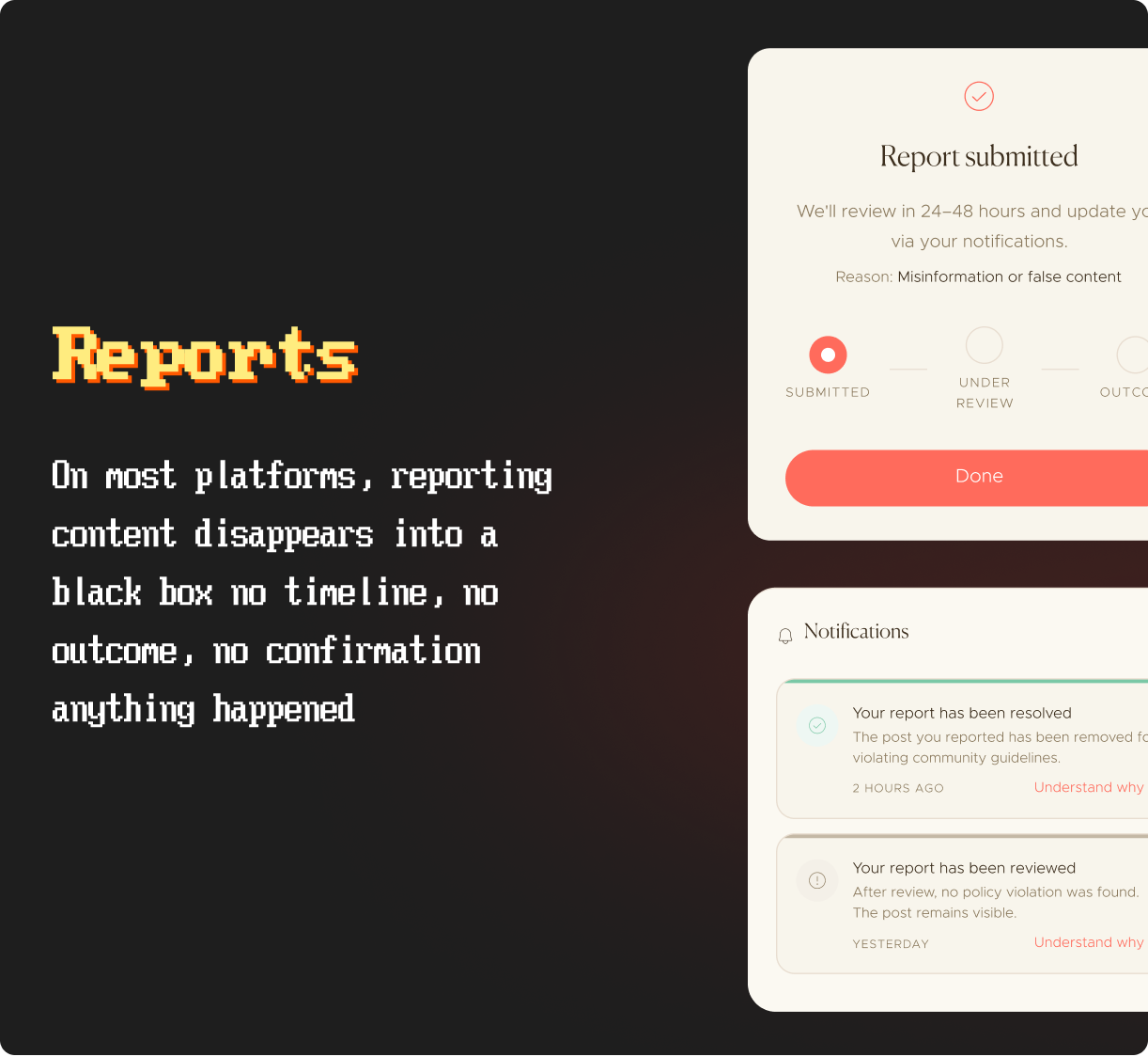
Reports vanish, friction dismissible in one tap
YouTube
Dislikes hidden, shares carry no consequence
Bluesky
Transparent architecture, but never reaches a single like
Process
Design Question
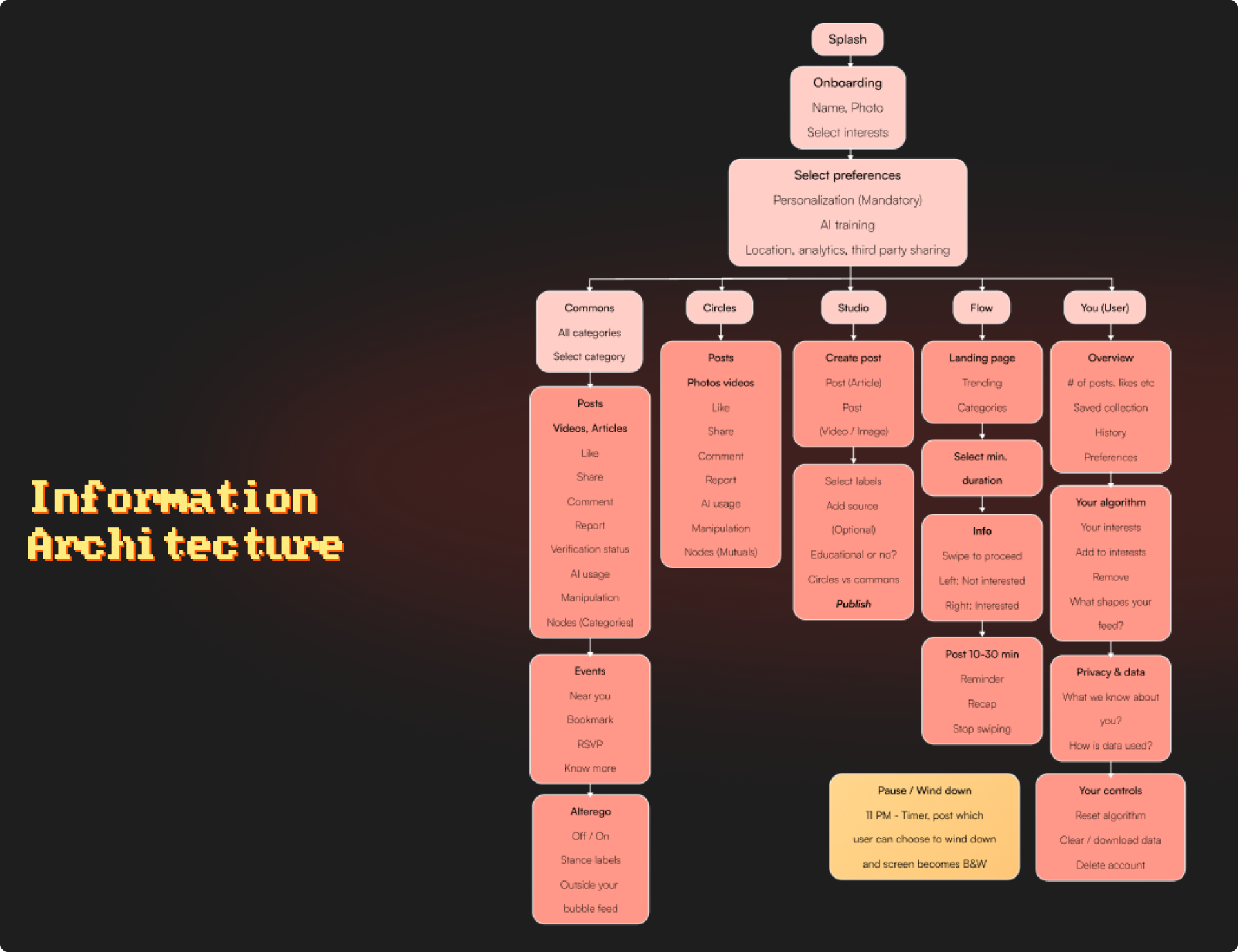
What does a social media interface look like when it is designed around transparency, human connection and intentional use and how should consequences visibility and friction be calibrated so they support rather than obstruct people?
The Solution
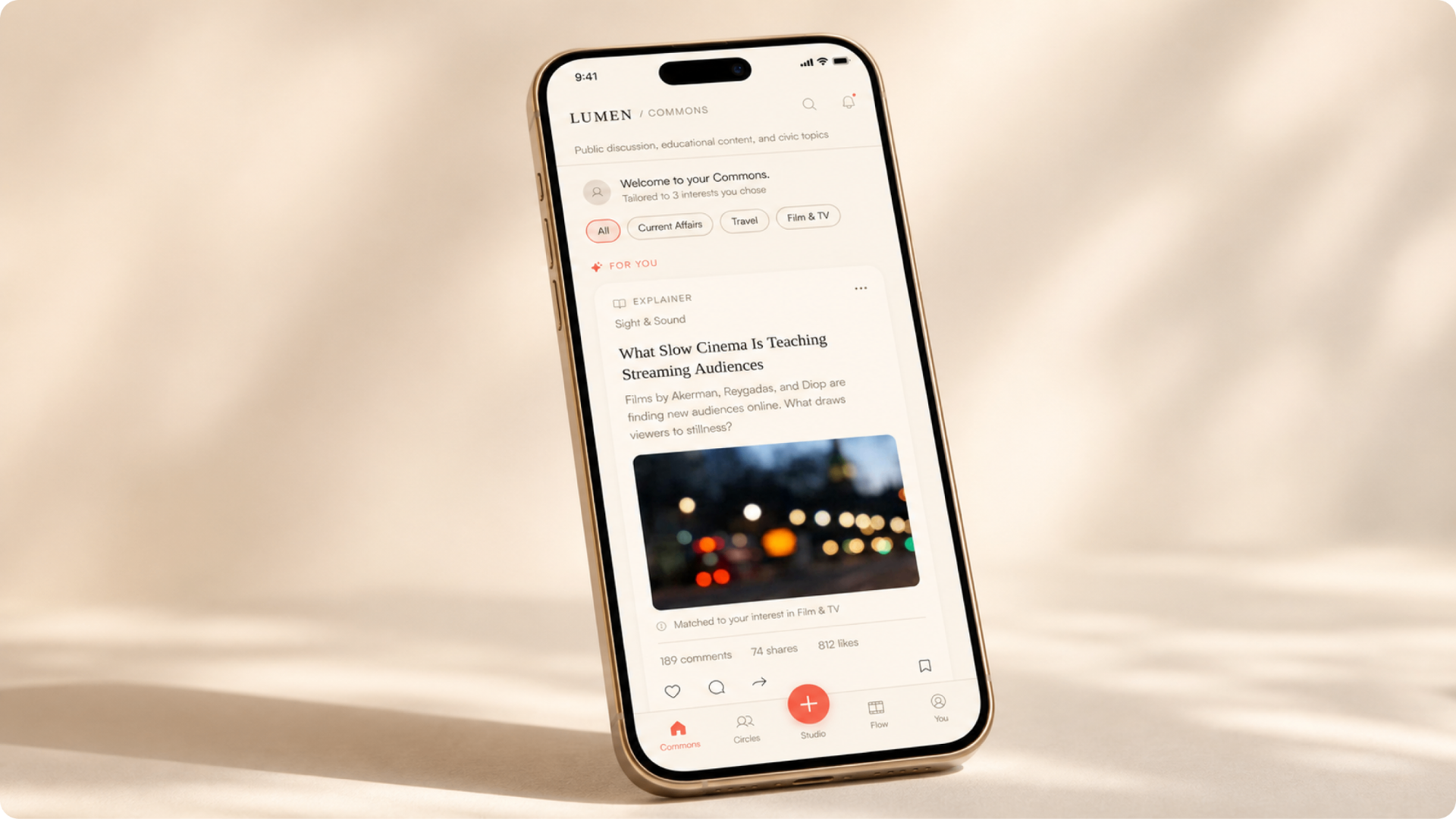
The app was designed around 3 commitments
Consequences made Visible
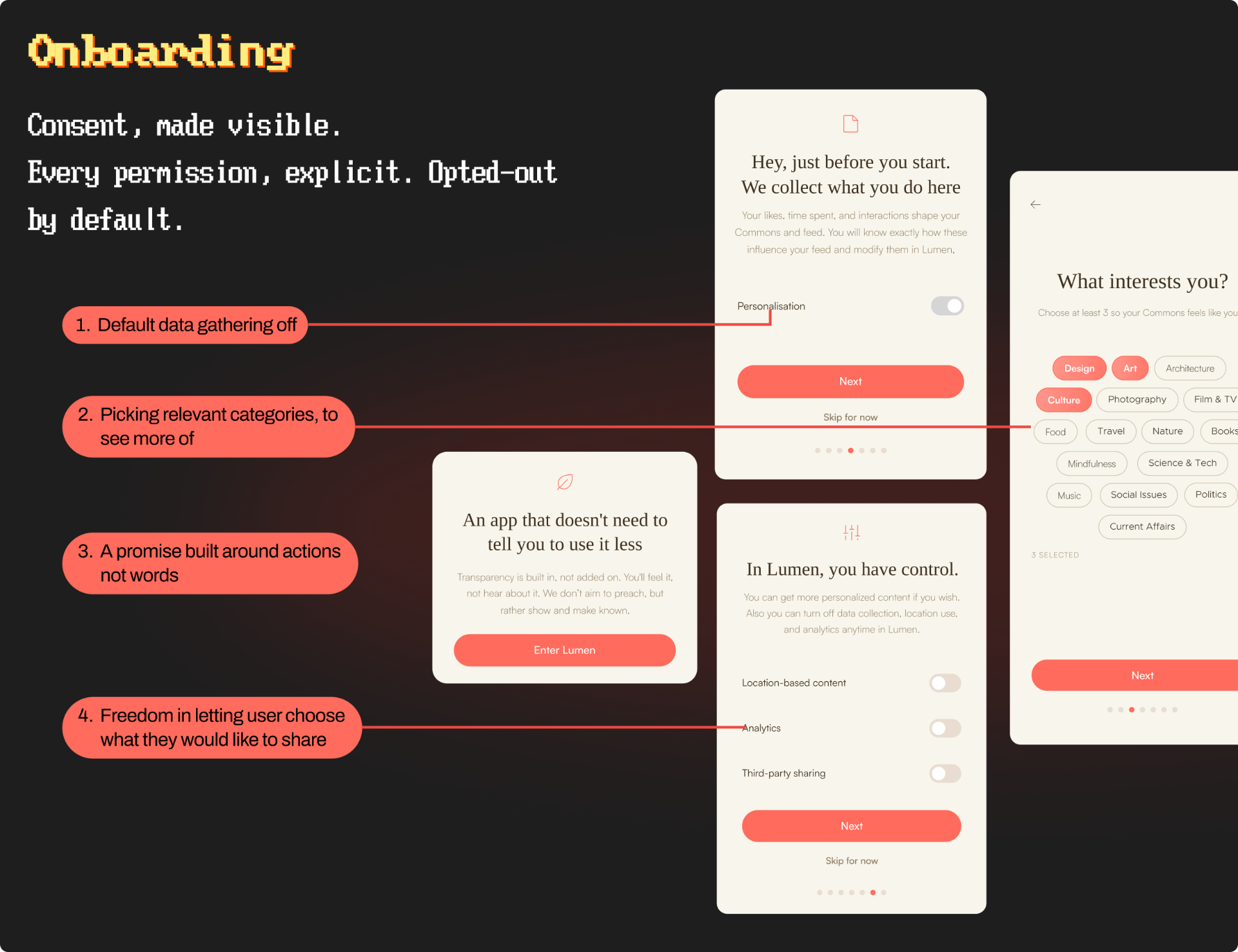
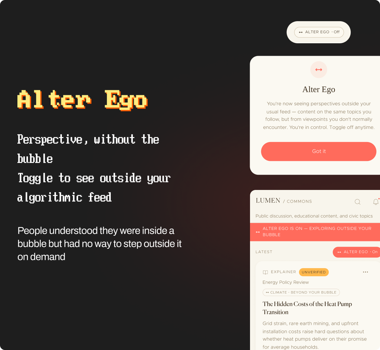
Instagram, YouTube, and Bluesky all leave users guessing what a like, share, or report actually does. Lumen closes that gap by normalizing the consequence of the moment of action, not buried in a settings page somewhere.
Friction as Respect
Most platforms treat friction as bad UX, something to remove. Lumen's research and evaluations showed the opposite: participants welcomed friction on sharing and reporting as an act of respect, not a barrier. Reflection prompts and confirm-taps aren't obstacles — they're a way of saying "this matters."
Public/Private Feed Separation
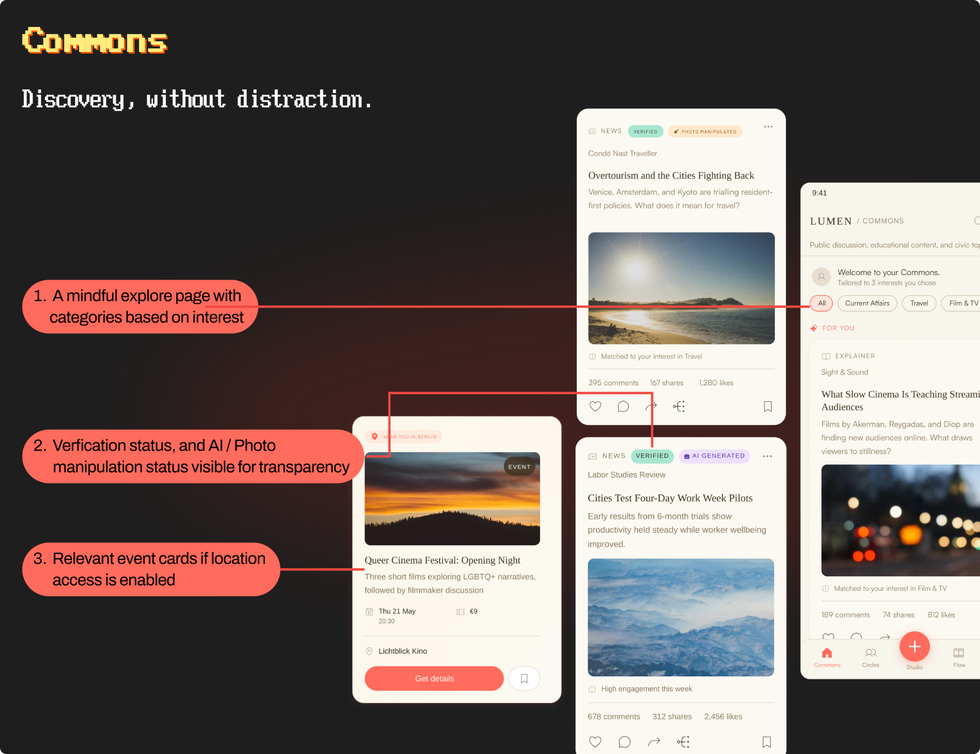
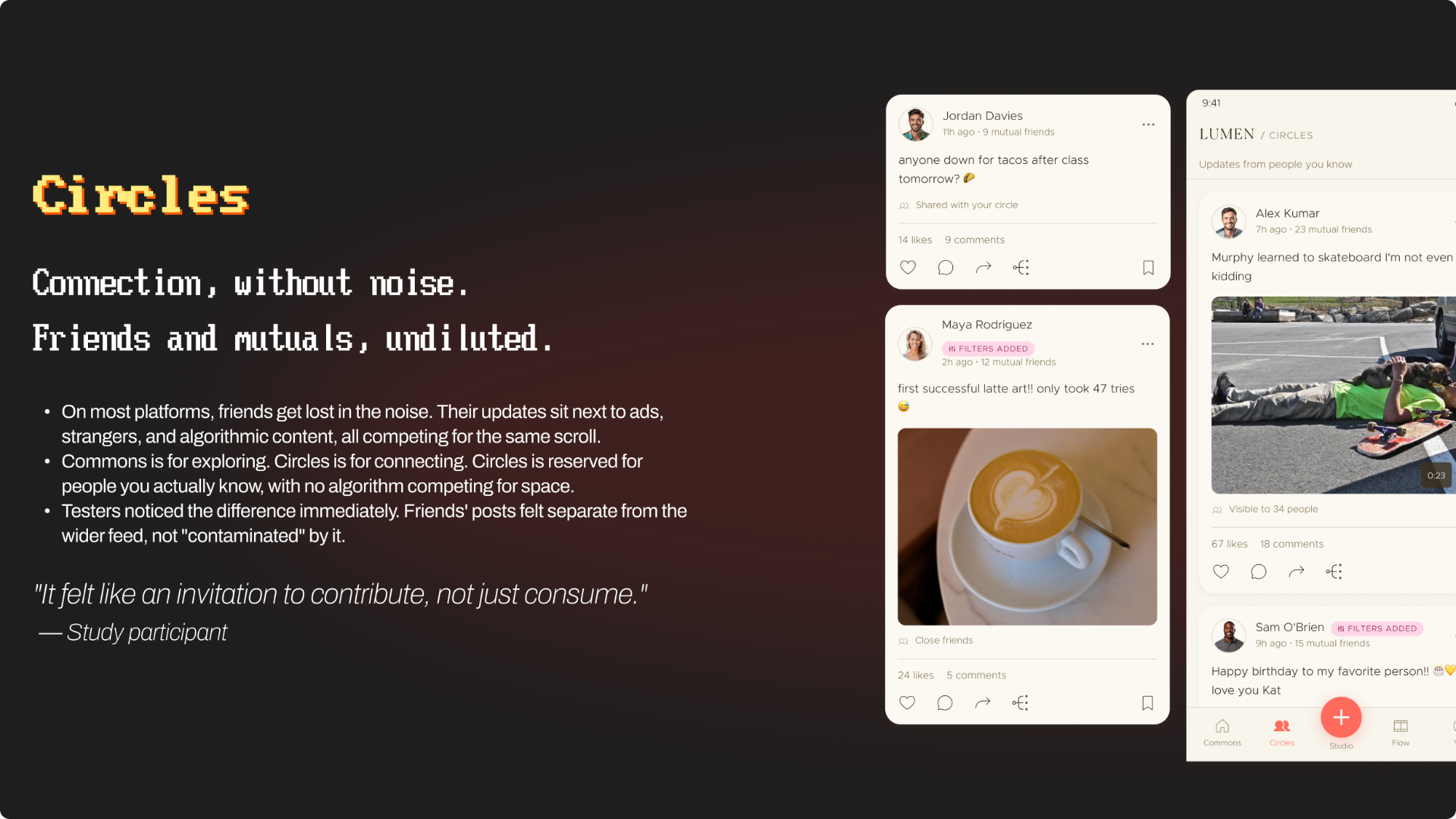
Commons handles open discovery, Circles handles close relationships. Keeping the two apart lets people show up differently in each — performative in public, honest in private — without one bleeding into the other.
Future Scope
Deploying Lumen over weeks or months to see whether transparency and friction hold up once the novelty fades.
Study 1's 15 participants (ages 21-30, 6 countries) point toward a problem, not a global picture. A larger, more demographically varied sample would test whether these patterns hold across ages, cultures, and platform habits.
Participants welcomed friction on sharing but rejected it on liking. Future work could quantify that threshold more precisely, testing exactly how much pause feels respectful versus obstructive.
Really deeply understanding the engineering mechanics to make features like verification, AI detection, and alter ego to work.
More case studies

GeneLink - An app to connect people with their long lost relatives using state of the art DNA mapping

Electra - A digital ecosystem for booking ships and for captains to effectively view ship status

UTI Mutual Fund - A mutual fund solution for India's oldest AMC, reimaging legacy solutions